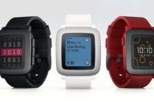
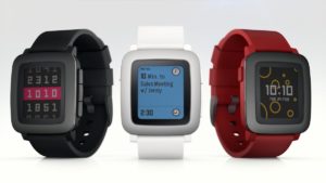
I really like the Pebble Time Black. It provides everything I need in a smartwatch, and the long battery life makes it worth it.
Why I Bought It
I was having issues with my LG G Watch running Android Wear, so I bought a Pebble Time, and I have zero regrets.
Keep It Simple
I used the LG G Watch for about a year, and despite its touch screen, higher resolution, huge number of available apps, and the elegance of Android Wear, I found that I really only used it to show the time and weather, and to show notifications from my phone. My new Pebble Time fills those needs intuitively, simply, and it does so while maintaining fantastic battery life.
Design And Look
I love the design. Many don’t like the large bezel, but I really don’t notice it. And it’s light! At 42 grams, it’s about 2/3 the weight of my LG G Watch at 62 grams. Due to its e-ink display, it is amazingly sharp and crisp in bright light. And when it’s not bright out, the backlight works very well. My LG G Watch’s screen was great in all but bright light where it was completely unreadable.
The Pebble Time is casual in design and look, but it’s still sharp and looks great.
Apps
The available apps are significantly less and more limited than Android Wear. While this may sound like a negative, to me, that’s a good thing because it lets me leverage those tasks that work really well on a smartwatch (like notifications and information consumption) and use the phone for those tasks that really make sense on a phone (like texting, placing calls, reading email, Web surfing, etc.) Once you understand the balance, everything just seems to be more seamless and sensible.
Many of the Pebble apps are clean, very solid, and they provide just what they need to provide without unnecessary bling or bloat. Sometimes, Android Wear apps can seem over-designed, simply because the platform has more capabilities. But more is not always better.
Buttons Vs Touch Screen
I thought I’d miss the touch screen, but given Pebble’s Timeline model, the buttons make perfect sense, and are completely intuitive. Many apps display on-screen indicators making it a snap to know what button to press. And many apps integrate the wrist-flick gesture to move between screens, so in some cases, you don’t even need to press the buttons.
Battery Life
Unlike Android Wear where the battery level is often reported to the exact percent, the Pebble Time displays at 10% increments. So if it is at 42%, it shows as 40%. At first, I was annoyed, because I missed the granularity of the Android Wear display, but quickly you find that the Pebble Time battery lasts days, not hours. You begin to realize that you simply don’t need that granular a display. In fact, if I put on my Pebble Time in the morning and the battery shows 30%, I know I’ll get through the day and don’t have to worry about charging. With my LG G Watch, at 30%, it would have been dead by lunch.

